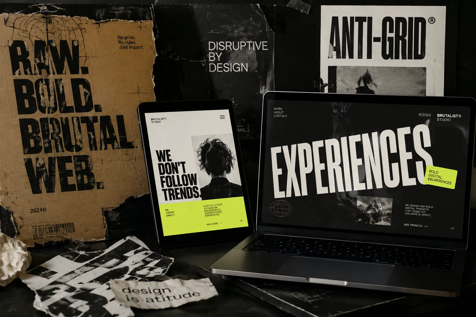
Over the past eighteen months, web design went through a noticeable homogenization phase. Automated site generation engines, template builders, and AI-prompted landing pages flooded the internet with identical rounded corners, identical pastel gradients, and carbon-copy hero banners. Visitors became numb to this predictability. In response, independent design agencies and tech product studios across the United States initiated a deliberate rebellion: tactile brutalism.
Escaping the Algorithmic Template Monoculture
Tactile brutalism takes the unapologetic clarity of architectural brutalism and injects it with rich physical textures, intentional contrast, and structured tension. Instead of hyper-smoothed glassmorphism that hides interface logic, this philosophy highlights raw gridlines, mechanical toggle switches, layered card stacks, and tangible paper or grain overlays. Users interact with buttons that appear to have genuine depth and deliberate feedback.
Hardware manufacturers and electronics brands lead this movement with exceptional enthusiasm. An audio synthesizer interface or an engineering workstation portal feels out of place inside an overly generic corporate template. Hardware demands tactile visual weight, authentic typography, and immediate functional feedback. When applied with precision, brutalist ergonomics ground digital products in real-world craftsmanship.
Anti-Grids and Kinetic Spatial Hierarchy
Strict twelve-column uniformity has given way to intentional asymmetry. Known as anti-grids, modern layout patterns place components in overlapping spatial arrangements while preserving rock-solid reading paths. Content boxes feature dark high-contrast borders, solid shadows with zero blur, and distinct technical badges that guide attention through hierarchy rather than decorative fluff.
Crucially, tactile brutalism is not an excuse for sloppy usability. Modern implementations maintain strict Core Web Vitals compliance, fluid responsiveness across smartphones, and accessible color contrast ratios. The approach celebrates human intentionality, reminding users that a skilled designer engineered every button, line, and interaction on the screen.
Interactive Research Breakdown
Tactile brutalism replaces repetitive template clones with organic layout structures, tactile borders, physical depth, and distinctive technical typography that captures user curiosity.
Chris M.
Verified ReaderDesign Lead • 04/24/2026
A Refreshing Rejection of Sameness
I love the move away from boring AI templates. Tactile brutalism feels so fresh.